Guided Tour Through Web Design History
Web design has been with us for a bit longer than 20 years now and sure, it is easy to criticize poorly designed websites nowadays, but few people really know how and where it all started. Things when web design started were really different – actually so different than such a website would be a shame today: weird colors, cluttered information, tables all over the place, Vegas lights and so many other things that everybody despises today. It is never too late to know a bit more about the history of web design, so let’s take a look at the most important changes throughout it.
Twenty years ago nobody knew what they were doing when designing a website. It was all something new and you couldn’t talk about strategies, research, laws, theories and typography. It was all chaotic. And it all started in 1989, when the first browser called World Wide Web was released, in the same time as the first website. However, it is not possible to see the first website ever, as there isn’t much information about it, but a website looked pretty much like this one and was used to give out basic information.
It all continued on a very slow path until 1996, which is considered by many the beginning of a new era in web design. Designers started using background colors – most of them really vibrant and painful to look at – but some of them kept it simple and decided to go for white – and even used some other fonts than the default ones. In this era people started overusing the animated GIFs we all hate today.
In the screenshot below you can see the Yahoo! website back in December 1996. This is one of the good examples of that year, but trust me, not all of them looked this good. You’ll see other websites below from 1996 – I am sure you can’t look at them for too long and would be able to make a very long list of mistakes. People were not doing this back then, because the web was quite new and they were really happy with the websites they had – these were huge achievements for them back then.
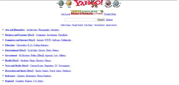
Yahoo!'s website in December 1996
McDonald’s webpage was incredibly hard to look at, although there was not much text. The background red combined with the yellow created a very powerful visual – truth is that everybody associates this color combination with McDonald’s today, so it might be also thanks to their first webpage.

McDonald's website in November 1996.
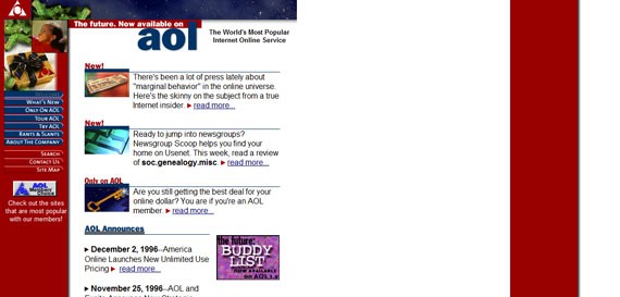
aol.com in December 1996
Aligned to the left and with a maximum width of around 600 px, Apple’s website was not very smooth back then – unlike today. However, their design was still one of the best available on the web and looking at it didn’t affect your eye’s health at all, unlike some of the other ones.

Although not as fancy as today, Apple's design from March 1997 was one of the best on the internet.
Shortly after this era, another one started: the era of Cascading Style Sheets. Although not even half as advanced as today, CSS made a huge difference back then. There were still many wrong colors being used, but the layouts started getting better and you can see in the screenshot below some of them even used a grid system, if you are not so demanding and precise.
Yahoo’s June 1998 website was actually looking good and it was one of the best of its generation. But what would you expect from the king of the web during the 90s?
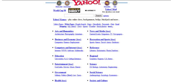
Yahoo! Kept a white and clean background, but still had blue link colors.
Google’s 1998 webpage, although the service was still in beta, looked really simple for that period, a trend which the American giant has continued with, right up until today. The main functionality of Google was and still is searching, therefore there was no reason to clutter the site too much.
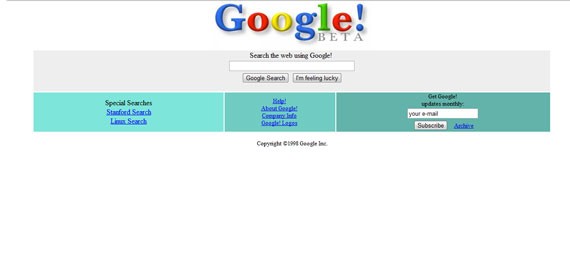
Google Beta (1998) had a smooth design.
As you can see in the screenshot below, Apple’s webpage evolved a lot from 1997 to 1998 and already started looking like what was going to be one of the pioneers of the minimalistic approach. Big visuals, not a lot text, no advertising and an interesting layout – this all started shortly after CSS1 and continues to this day.
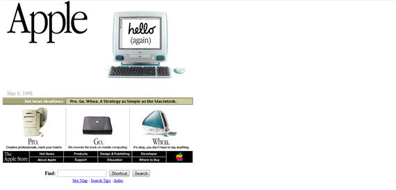
Apple.com in July 1998
Even AOL’s website looked better by April 1998. They started to have a grid system, used the colors of their logo and personalized their menu by using buttons.
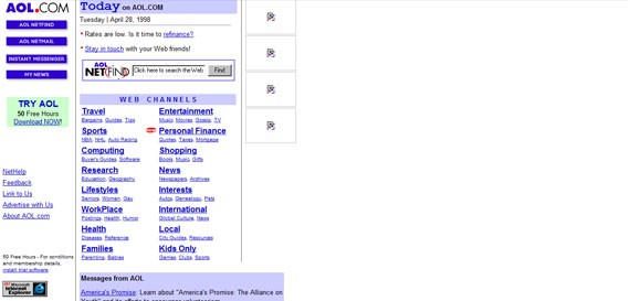
AOL in April 1998 (not all the images captured)
The colors were becoming even more popular because designers thought they will keep the people on their web pages. They didn’t think the same colors would make it impossible to look at the page for more than a few minutes. However, as said before, the good that came from this was the fact that it associated colors with brands – blue for Microsoft, red and yellow for McDonald’s and so on.
Another problem were the fonts. Times New Roman and Courier New were very popular (Comic Sans was already released and soon to become hugely popular). Although there were many other options, people preferred to use these two typefaces in everything, from web pages and invitations to e-mails and documents. Writing with black was popular and everybody kept it like that. If there was something which needed to stand out, red was the color of choice. Otherwise I am sure you remember the blue underlined links (which you can see in most of the examples shown here until now). Because typography was not an important part of the design, bold and italics were not very used either to make text stand out. A font that was widely used in the 90s and is still very popular today was Arial, which can even be seen on AOL’s website.
Leaving too much empty space was madness back in the 90s, also because centering a web page was not very popular. You can see Yahoo!’s first website (shown above) and notice how much empty space there was on the right side. People also started using background images, but because the images were not big enough, in many cases they started to repeat them and this created an awful visual.
Buttons also started to appear and become more and more popular, because they allowed designers to further customize the menus and put the focus on the navigation, while icons were also used all the time – it was the first time when visual elements had a use. This was also the period when animated GIFs exploded and everybody used them. There were almost no websites without them and people really appreciated the effect they created.
The year of 1999 was the year of a change. People started to design smarter and thought more about usability, grid systems, layouts and even colors. Most of the websites with vibrant background colors were redesigned and started looking better (McDonald’s got rid of that vibrant red from the background one year before).
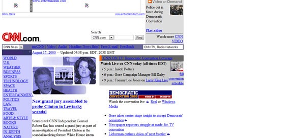
CNN's webpage in August 2000 (not all the images captured)
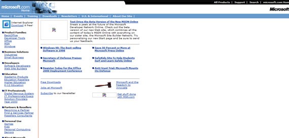
Microsoft in February 1999 (not all the images captured)
Shortly after this, bright colors were on the way out and creating contrast between the background and the font color was critical. Most of the designers started using white as the default background color and it worked really well. Designers started designing in pixels instead of inches like they had been before. Maybe the most important thing was the fact that the content of a page was ordered, with the menu being in focus most of the time.
The importance of typography increased as well during this period, with people thinking a bit more about the target audience. Comic Sans becomes popular for child websites (although for a period it was used for everything) and some other fonts come into focus. There was no option for embedding back then, so designers were constrained, but at least they started to experiment more with what they already had.
Websites were not flexible at all back then and because of the many screen sizes available, it was difficult to design something to look good for everybody – responsive design was just unheard of. The use of buttons started to decrease as well because people learned how to properly play with font and colors – typography’s importance increased even more.
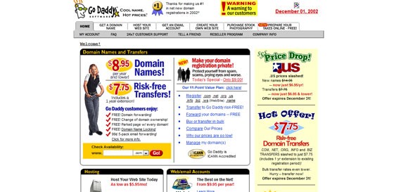
GoDaddy's website from December 2002 even had a dropdown navigation.
By August 2002, Apple’s website looked a lot like the one they have today. The navigation was a dropdown, they used big images for the featured article/product and four small boxes for other products at the bottom – a lot of similarity with Apple’s current website. The Cupertino-based company showed everybody how they should design a simple, but effective website.
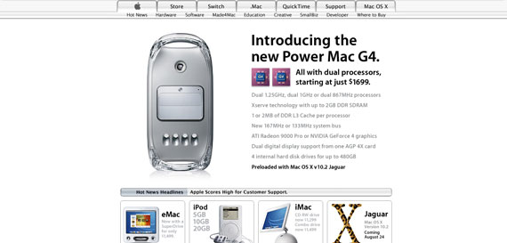
Apple in August 2002.
The use of icons and boxes increased. As mentioned earlier, icons were a good way of focusing the users attention (especially on navigation links), while the boxes were used to help the user find his way around the website and also for structuring content. Luckily, the use of animated GIFs decreased by this period and they would never be as popular as they were a couple of years before.
Another era started in 2002, when the so-called web 2.0 concept appeared for the first time. The use of colors became more theoretical and everybody used them to make the websites more appealing, rather than flashy. The use of Flash – right then on its way in – was popular until 2008 when its use decreased dramatically. Flash animations became more and more popular and most of the websites started looking more professional, as we would say today.
Forums were already spread around and most of them had the same look and feel, like in the image below.
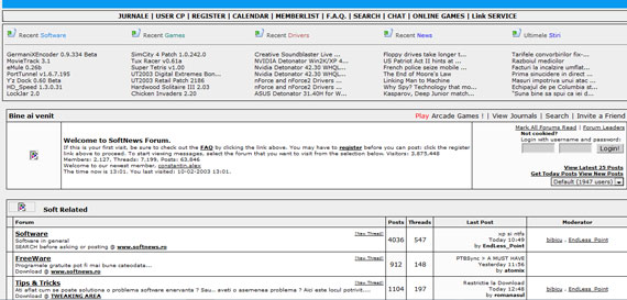
Softnews Romania in February 2003
Shortly after this, the hover effects started to appear and they were a hit. Everybody was using them because they created focus and helped the user navigate.
Footers were also increasing in popularity and they were always used to display copyright information, privacy policy, terms of use or contact information.
Color palettes started to become harmonious and be used wisely. They started to create impact and designers knew that, if used correctly, colors can make a huge difference, especially then when not everyone had this information. The use of typography increased and, combined with colors and contrast, made the text interesting – for the first time in web history.
Responsive web design still didn’t appear at this point, but at least there were no more problems with background images. Now it was easy to calculate everything in pixels and repeating background images disappeared (they appeared again later on to create what we now refer to as patterns). Also, using background images instead of solid colors went low-key and designers preferred to avoid it.
Probably the first real interactive website was one for Coca-Cola. They showed the world how to use colors smartly and how to integrate them with flashy, visual animations that kept the users on their page for ever, even if there was not really too much going on there.
The web as we know it today started in 2005, when everybody realized cluttered sites are not popular, and started to keep them as simple as possible. Single pages appeared and made a huge impact because they were just what lots of users needed. Single pages gave design a fresh look and simplified the navigation. Designers started playing with font sizes and color and combined them so that text was in focus – integrating multiple fonts was tried for the first time in this period. The “back to top” button was also seen for the first time in this period and many websites adopted it, as it made navigation easier.
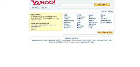
By mid 2006, Yahoo!'s webpage was simple and effective - no flashy elements.
In this period websites were becoming more than just a way of supplying basic information. They were part of an identity, soon even a part of a strategy and people visited them not only for information, but also for relaxation and inspiration.
In 2008 another era started, which lasted for only few years (although some signs of it are still online today). This was the retro period, where old fashioned elements started becoming popular. No, not the GIFs and the tables, but retro colors, text, illustrations and other elements could be seen all over the place. This is also when the minimalistic design approach started, but it was nothing more than an idea yet.
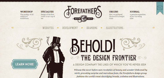
forefathersgroup.com incorporates lots of retro elements
The minimalistic approach started to become more than just an idea in 2010. We are currently in the minimalistic era, where it all has to be designed fast, it has to stay simple and still do its job and create an experience for the user. At the same time, although many websites turn to this concept, each one of them has to have something special – so that people will remember it and come back. Now it’s a lot about colors, typography and contrast – the best one being between white and black.
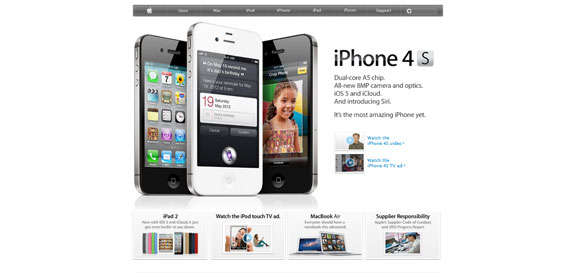
How simple can a website be? Apple's the best example.
There are things we can notice everywhere. The color palettes are congruent and are not thrown out there just for the sake of it – they are used with a purpose. Hierarchy was introduced as well and it is not only shown through position, but also through font size, font type and colors. Balance is also a key word in today’s web design and creating a positive, attractive atmosphere on the website is the purpose of any designer. Responsive web design is popular today and there is no such thing as not being able to make a website look good on all the screens.
The typography goes beyond limits and being able to embed fonts made it even more challenging and interesting. Although too many fonts can lead to a bad design, if you know how to use them you will learn the key to getting people to read your text. Buttons are still used (think of Twitter, Facebook, LinkedIn and RSS) and are the way to navigate through pages, although they are not widely used anymore in menus. The problems with images and resolutions disappeared as well.
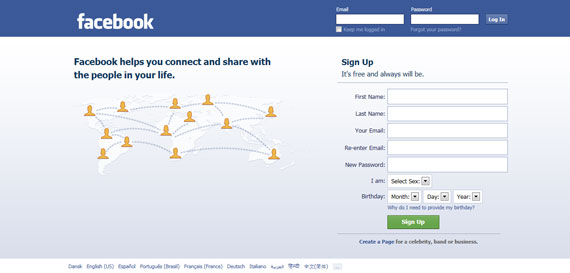
There is also a new style in town for background choices. There can be images, patterns or even solid colors – in today’s web you can integrate them with everything. Animations are not popular anymore, but are still used here and then – however, they do not affect the loading speed of the sites as much as before.
With more than 20 years since the design started to develop, it is easy to see that everything moves fast and that everything keeps improving. It is amazing how you can think that nothing can be better, and then in a few years something new comes and everybody is excited about it. The internet went from rough to beautiful and useful and will most definitely continue on its path upwards. Lots and lots of changes will continue to be made and the question is: are you ready for them? Are you ready for when a crazy designer will see an opportunity to push the web even farther? Will you jump on his bandwagon or will you just continue to do things the way you do already? If the history of web design has taught us something, it is the fact that we always continue to evolve. You should always be ready and willing to do the same when the opportunity arises…
No comments:
Post a Comment